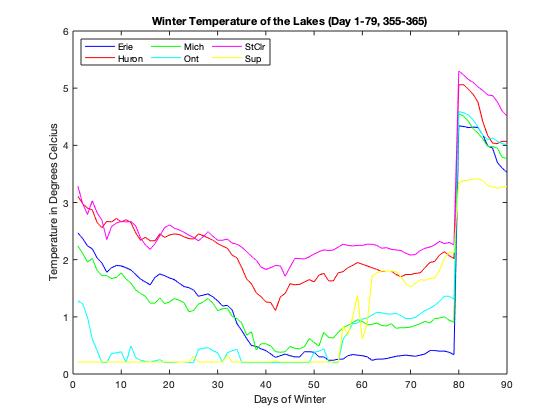
The graph that we chose as our favourite is the graph that shows the winter temperature of each lake from day 1 to 79, and day 355-365. The graph shows the how the temperature of the water changes as the year goes on in the winter season. An element of a excellent graph is having the dat be clear a concise. This is shown in our graph by the different colours of the lines that represent the temperature of each lake as the season goes on. The way that the colours intertwine and show the relation between the lakes is one reason why we like this graph. Another reason why we like this graph is that the graph shows the trend of the lake temperature across the year. One of the main aspects of our graph is the straight slope of the graph at day 79. This is because at day 80, the season changes to spring thus, it the end of winter. The graph continues as winter returns closer to the end of the year. During this break we can see that the temperature rises just by the change of slope. When winter begins again, we can see how much the temperature changes over the rest of the year. Due to this main feature of the graph, it places our pick as our favourite graph.
